Co-Branding Dutch literature
As joint guests of honour at the 2016 Frankfurt Book Fair
2016 marked the guest of honour presentation by Flanders and the Netherlands at the Frankfurt Book Fair, only the second time in the history of the fair (after Flanders and the Netherlands’ first joint appearance in 1993) that two organisations representing two separate governments have presented together. What happens when Flanders and the Netherlands team up to present their shared literature to the publishing world?(Fairs#Fairs)
The Frankfurt Book Fair is the publishing world’s largest, most important trade fair. It attracts thousands of book professionals from around the world and hundreds of international press. A role of special prominence in this rarefied transnational space goes to the guest of honour, which ‘sets the tone’ for the year’s fair and occupies a 2300-square-metre pavilion designed to be its ‘beating heart’. Walking the halls of the fair, one hears all different languages. But English is the lingua franca of the global publishing industry — and that shows clearly in the branding materials we analyse here.
The road (back) to Frankfurt
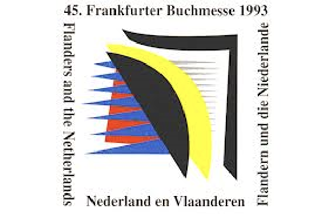
The official logo of the Flanders and the Netherlands’ joint presentation at the 1993 Frankfurt Book Fair.
Mounting a successful bid for the guest of honour platform nowadays is a competitive, long, and expensive affair that starts years or even decades before opening day. For Flanders and the Netherlands, the journey to becoming the 2016 guests of honour began as soon as their first joint showing at Frankfurt in 1993 ended. Helped along by some 130 book translations into German published in the lead-up to and aftermath of the fair, the 1993 Schwerpunkt unleashed a ‘Dutch wave’ across the German-speaking world, which would flow over into other language markets as well.
Since 1993, the number of translated Dutch and Flemish authors has substantially increased, as has the number of languages into which their work is translated. The event is widely seen as a breakthrough moment for Dutch literature in the world – a literature that, up to that point, had remained largely undiscovered beyond its borders despite a rich tradition at home. It also played a key role in the elevation of several Dutch and Flemish writers to international stature, of which Cees Nooteboom is probably the most renowned (despite his initially tepid reception at home).
On an institutional level, the experience of jointly organising the 1993 fair helped to solidify the strategic partnership between Flanders and the Netherlands in the area of the international promotion of Dutch literature, which today is continued by the Dutch Foundation for Literature and Literature Flanders, the two government organisations that promote literature produced by Dutch and Flemish authors. The groundwork for this partnership was laid in 1980 with the founding – in the midst of the Belgian federalisation process – of the Dutch Language Union (Nederlandse Taalunie), a treaty-based, intergovernmental organisation representing the Netherlands and the Flemish Community with a mandate to jointly promote the Dutch language and its literature in Dutch-speaking areas and abroad.
Co-branding Dutch literature
While the decision to work together may have made the 2016 appearance possible, it also necessarily meant that the Dutch Foundation for Literature and Flanders Literature had to collaborate closely on its planning, execution, and branding. How did they go about this? The answer reflects a long tradition in the Netherlands and Flanders (respectively) of consensus decision-making based on a pragmatic recognition of pluriformity and cooperation despite differences.
![]()
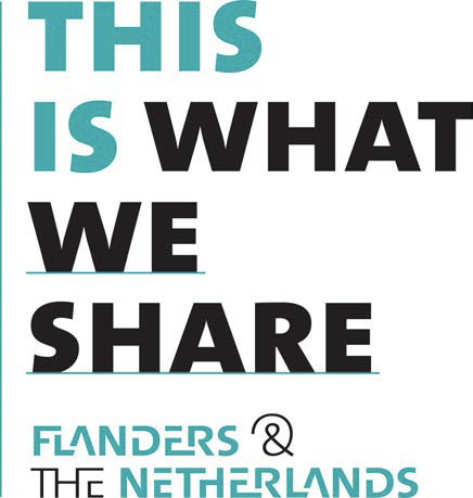

As it turns out, creative nods emphasising the collaborative partnership between Flanders and the Netherlands are omnipresent in the project’s branding, beginning with the official motto: ‘This is what we share’. It is also reflected in the blues in the logo, which, as artistic director Bart Moeyaert explained to me, represent the blues of the Westerschelde, the mouth of the River Scheldt, where the two territories of the Netherlands and Flanders flow together. Complementing the blues is a yellow/grey, the colour of North Sea beach sand. The notion of fluidity between the two partners is further activated in a font style designed by Jo De Baerdemaeker especially for the fair, whose letter structure is inspired by the famous typographical collections of Plantin-Moretus of Antwerp, Johannes Enschedé & Zonen of Haarlem, and Lettergieterij Amsterdam. Ligatures have been added so that each letter runs into the next, illustrating again the ‘dynamic flow’ between the Netherlands and Flanders.
We find a similar visual logic on the website: page templates are replete with a moiré effect where one pattern of lines is superimposed onto another to create the impression of waves. Waves are quoted again in the formatting of the (very popular) collector postcard sets produced for Frankfurt and distributed as teasers at various other book fairs on the 2016 circuit. They are printed as leporellos (an accordion-like format), the visual logic being that Flanders and the Netherlands are equal partners, with neither out-sizing the other. (Making waves together is fine as long as one does not wash out the other!) And then there is the official portrait, featuring the work of Flemish photographer Stephan Vanfleteren: portraits of different faces of the 70-member author delegation (36 Dutch, 34 Flemish), each superimposed over the other to create one single, not-quite-distinguishable visage.
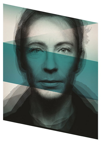
Official portrait featuring photographs of writers in the official delegation superimposed on one another to create a single visage.
Obscuring the nation on the book world’s largest transnational stage
The branding materials created for Frankfurt 2016 are just as striking for what they do not contain: no callouts to specific marque authors, no claims of excellence, prestige, or singularity, and most striking of all, no national markers. There is no orange for the Netherlands, no yellow and black for Flanders. No windmills or recreated red-light districts. No poppies or pastorals. Be it on the guest of honour website, the programming on the pavilion stage, or the membership of the official delegation, authors’ Dutch or Flemish status is never outwardly advertised.
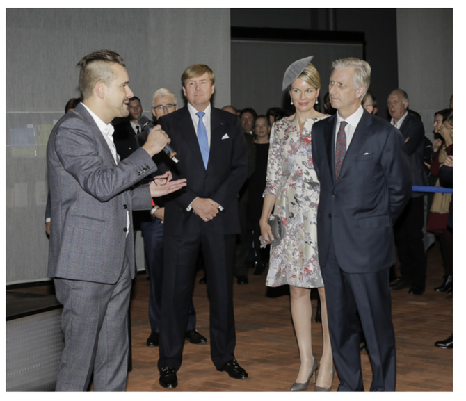
Artistic director Bart Moeyaert gives King Willem-Alexander of the Netherlands, Queen Mathilde and King Philippe of Belgium a personal tour of the pavilion on opening night. Geert Bourgeois, Minister-President of Flanders, can be seen (partially obscured) behind Willem-Alexander.
One national marker that did manage to make it into the branding for Frankfurt: the official formulation of the name of the 2016 guest of honour, ‘Flanders and the Netherlands’: it is explicitly dual (Flanders and the Netherlands) and implicitly statist (Flanders and the Netherlands) rather than region- (the Low Lands) or language-centric (Dutch literature). For Flanders, this confers a de facto nation state-like status, a legitimacy by association strengthened by its being named before rather than after the Netherlands. In this light, the broader strategy of co-branding Dutch literature in a way that obscures national distinctions can actually be seen as a covert and clever strategy by Flanders both to ‘top the bill’ at Frankfurt and to ensure an outsized share of the stage. Whether this will result in a proportionate share of any future payoff in terms of book translations and international recognition remains to be seen.
The trappings of state were limited to the opening ceremony, where representatives of the Dutch and Belgian (!) royal families made a grand entrance and were given a royals-only tour of the pavilion before disappearing for the rest of the fair. Quintessential symbols of Dutch and Flemish culture were really only openly evident during the happy hour receptions each evening: beer and chips from Flanders; bitterballen and cheese from the Netherlands. Recalling Emily Apter, contrary to the ‘celebration of nationally and ethnically branded “differences” that have been niche-marketed as commercialised “identities”’ one could have expected , the brand identity of the 2016 Guests of Honour was distinctive precisely because it was not.
(Jack McMartin)
References
This post is a condensed version of a longer book chapter: McMartin, J. (2021). ‘This is what we share’: Co-branding Dutch literature at the 2016 Frankfurt Book Fair. In: H.M. van den Braber, J.J M. Dera, M. Steenmeijer, J.H T. Joosten (Eds.), Branding Books Across the Ages, (273-292). Amsterdam: Amsterdam University Press.
Apter, E. (2013). Against World Literature. London and New York: Verso.
Heilbron, J., & van Es, N. (2015). In de wereldrepubliek der letteren. In T. Bevers, B. Colenbrander, J. Heilbron, & N. Wilterdink (Eds.), Nederlandse kunst in de wereld. Literatuur, achitectuur en beeldende kunst 1980-2013 (20-54). Nijmegen: Vantilt.
Missinne, L. (2018). Van 1993 tot 2016: Nederlandstalige literatuur in Duitse vertaling tussen de twee Buchmessen. In L. Missinne & J. Grave (Eds.), Tussen twee stoelen, tussen twee vuren. Nederlandse literatuur op weg naarde buitenlandse lezer (11-32). Ghent: Academia Press.
Zajas, P. (2014). Before the ‘Nooteboom Effect’ - Dutch Literature at the Suhrkamp Publishing House. Journal of Dutch Literature, 5(2), 1-19.